ShipEngine
Powering over one billion shipments
Digital Support
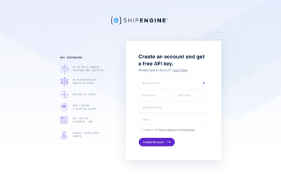
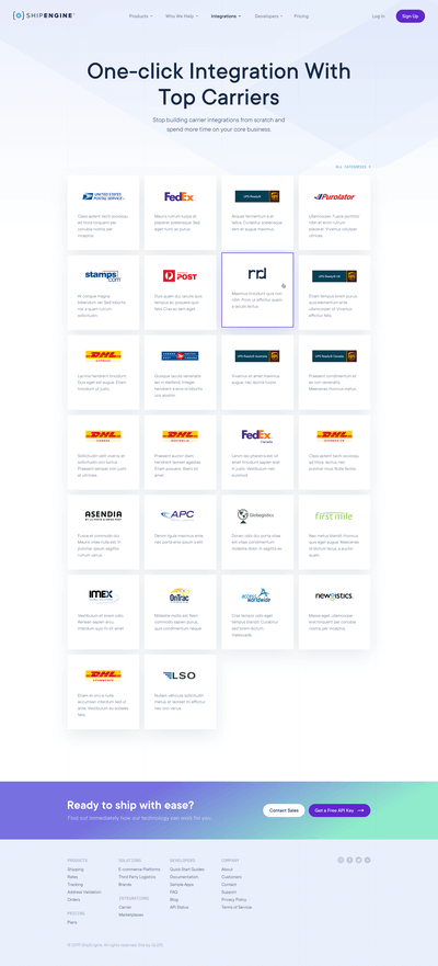
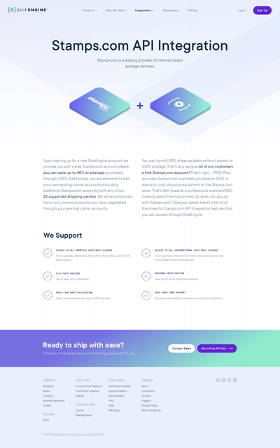
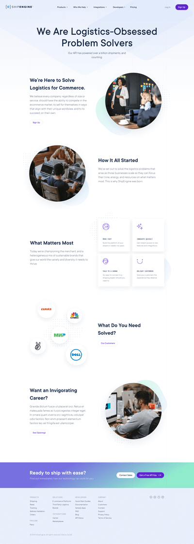
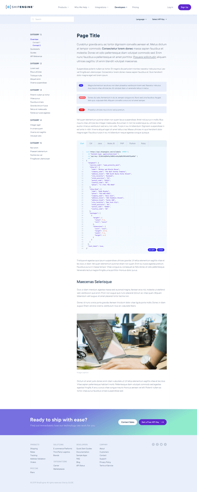
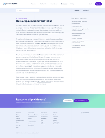
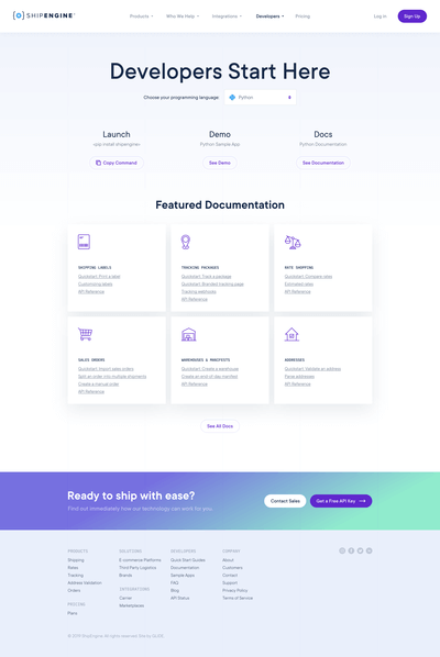
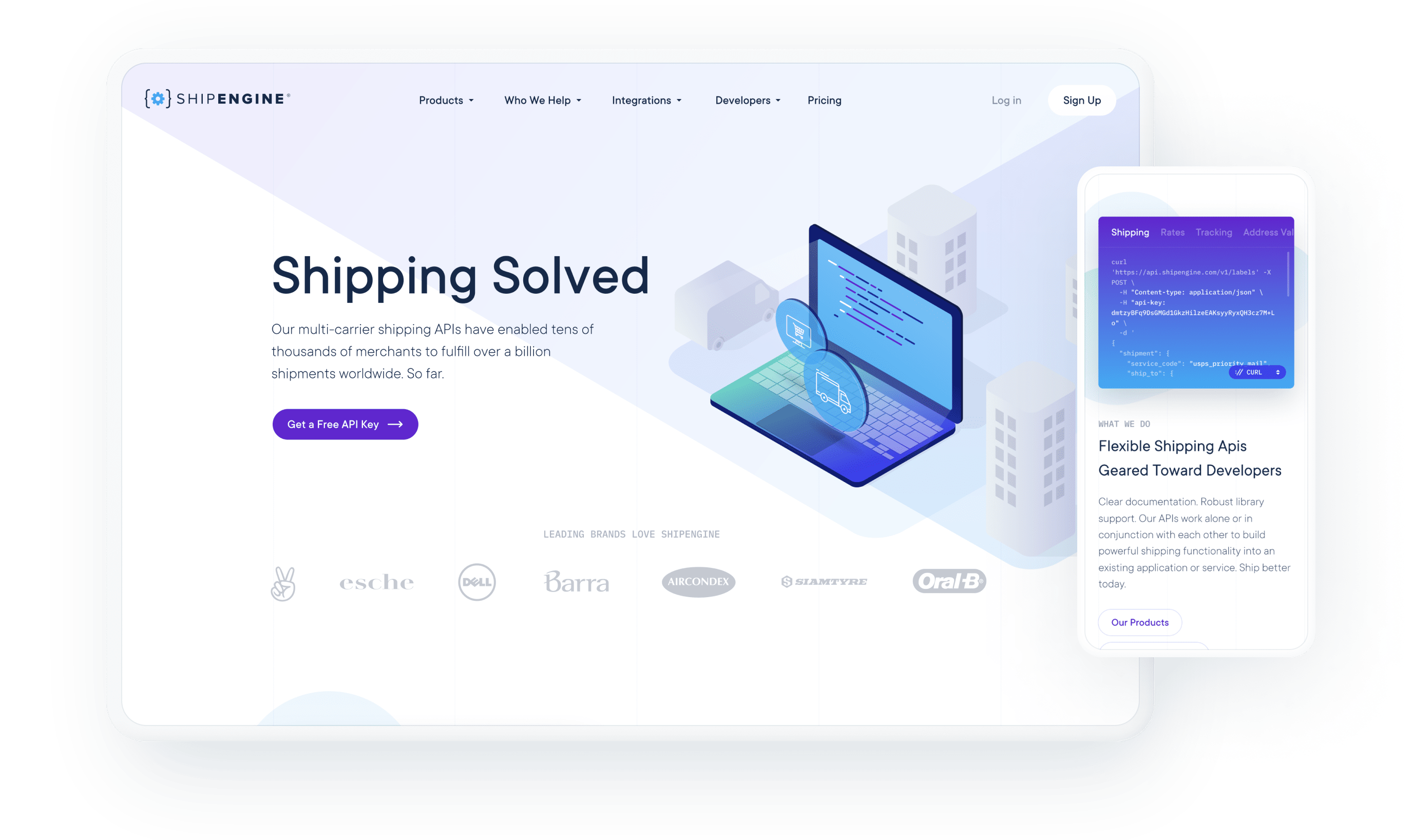
What does a website look like for a business that sells code? For ShipEngine, makers of widely used shipping and logistics APIs, the answer was clear. Keep it clean, easy to use, and lightning fast. Then sprinkle in some sexy code snippets 🙂


Sixth time’s the charm
As nice as it is to nail a design on the first try, it doesn’t always result in the most rewarding work. Building websites is a collaborative process, so we love when clients are outspoken and engaged during the early stages of design. On this project, we went through a half dozen or more color schemes before landing on a style we all loved. With the global styles set, everything else fell into place accordingly.
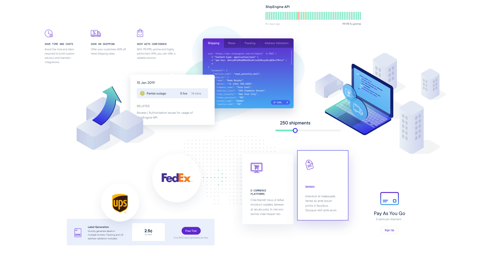
In the lead up to launch, we noticed the site underperforming our expectations in a few key speed tests. Once we identified the problem—a caching issue—we were able to recompress certain assets and improve load times for the areas in question. Then we performed the same tests once the site was in its final hosting environment to make sure it stayed snappy.
So far all signs are pointing to increased visitor engagement and an improved user experience. Anecdotal responses are overwhelming positive, but as we collect more data, we’ll be able to tell which changes are having the most profound impact on their ultimate goal: getting new sign ups. Launching a new site should have an immediate positive effect, but it takes ongoing testing and optimization to get the most out of it.


