Mandt System
A better way to reduce workplace violence

Digital Support
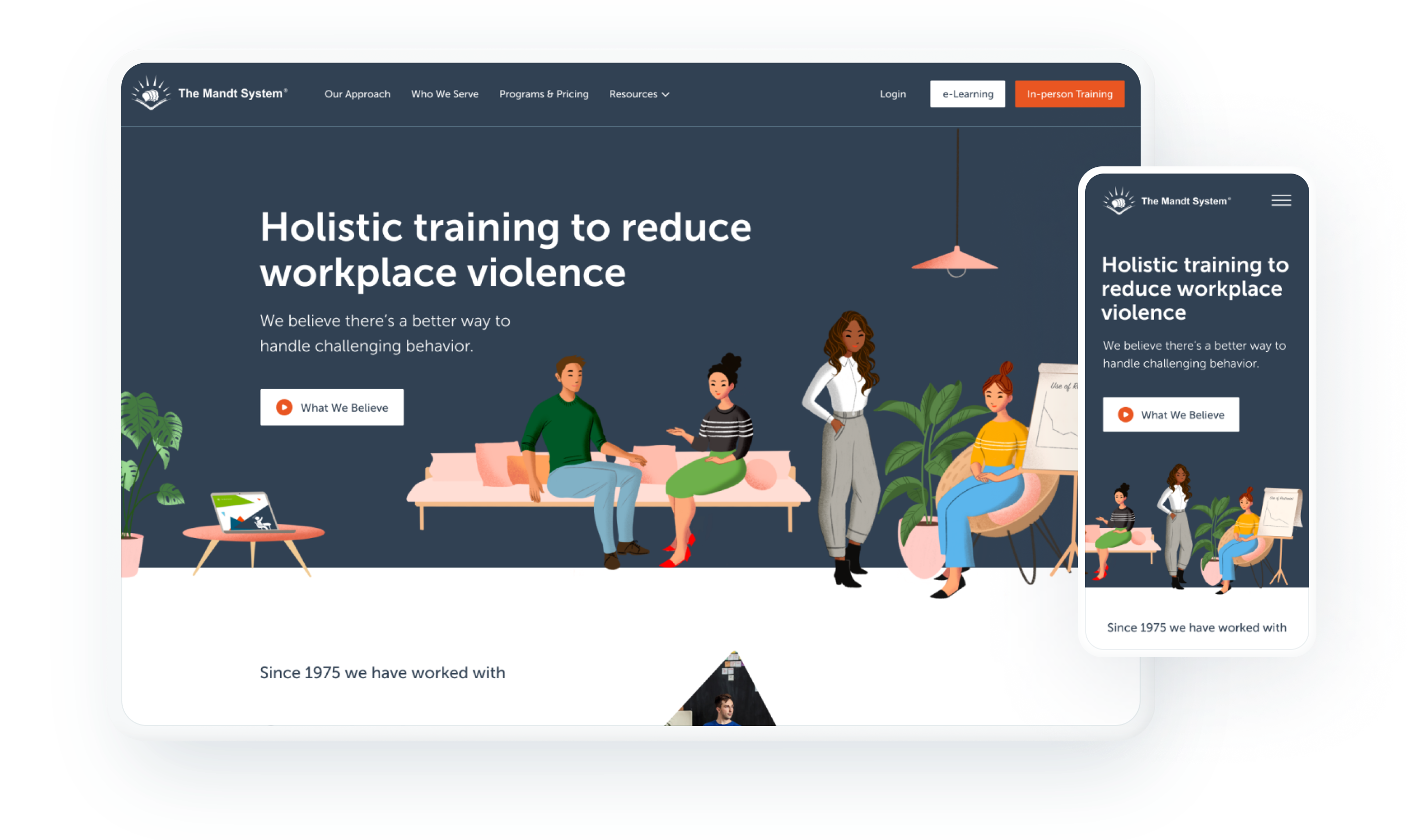
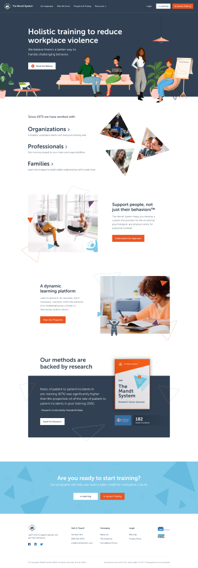
If we were allowed to say we had favorite clients, Simon and Kevin of Mandt would certainly be in contention for the top spot. Flattery aside, though, we are proud to have gotten multiple chances to work with them and help further their mission of reducing workplace violence. Regarding this project, Mandt enlisted GLIDE to modernize their website and improve the visitor journey from start to signing up for training.


An illustrative style
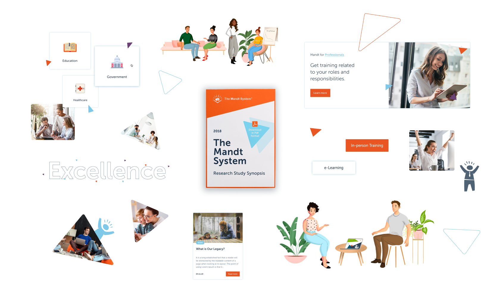
It’s great working with clients for the second time because by then we have their trust and we’re able to take more risks. In this case, we pivoted from using photography in the hero banners to a modern illustrative style. This allows key messaging to come into focus, while the graphics fall back as supporting elements. Illustrations are clean and highly versatile.

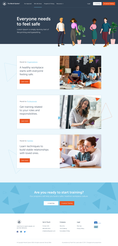
One of the keys to conversion is simplifying and guiding the experience. If you give somebody too many options, they have trouble making a decision (the paradox of choice). Our goal is always to break the decision making process into bite-sized chunks. For the Mandt site, we offer two options up front (in-person or e-learning), then drill down one more layer and that’s it.
Since site launch, we are constantly thrilled to hear about the enthusiastic response they’ve gotten from visitors. Success can (and must) be measured in terms of concrete goals, but the GLIDE team is only satisfied when a site performs well AND produces that intangible feeling we call delight. What a joyful collaboration!


